
Reading Time: 12 Minutes
Difficulty Level: Beginner to Intermediate
Reviewed By: FinanceInfoIn Editorial Team.
Table of Contents
- The Real Cost of Bad AI Prompts
- Breaking Down the Language of AI
- Setting the Scene with Artistic Mediums
- Mastering Lighting and Camera Angles
- The Secret Formula for Realistic Details
- Fine-Tuning Your Masterpiece
Quick Summary
Learning to talk to text-to-image tools can feel completely overwhelming. This guide breaks down the exact structure needed to get exactly what you picture in your head. You will learn how to use modifiers, lighting keywords, and camera terms. By the end, you will stop wasting time on weird outputs and start generating stunning, realistic visuals.
Key Takeaways
- Vague words create confusing and unusable pictures.
- Always specify the artistic medium first.
- Lighting and camera angles change the entire mood of a picture.
- Keeping your instructions organized prevents the system from getting confused.
- Small adjustments to your text make massive differences in the final output.
The Frustrating Reality of Talking to Machines
Nothing drains your confidence faster than typing a brilliant idea into a text box and getting absolute garbage in return. With a massive client presentation just hours away, I was desperately trying to generate a simple visual of a modern workspace. The clock was ticking past 2 AM, my eyes were burning, and I had just confidently pressed enter on what I thought was the perfect set of instructions.
Thirty seconds later, I stared at a picture featuring a person with seven fingers drinking coffee out of a floating mug. I tried again, adding more words, changing my sentences, and pleading with the machine. My coffee went cold, my eyes burned, and my stress levels went through the roof.
It felt like I was speaking an entirely different language. You have probably been exactly where I was. You have a beautiful, clear vision in your head.
You need something specific for your website, your social media, or a project. You type out your instructions, but the machine spits out something that looks like a strange nightmare or cheap clip art.
It is incredibly frustrating when you pay good money for advanced software, only to waste hours generating unusable junk. This daily struggle drains your energy and completely destroys your creative momentum.
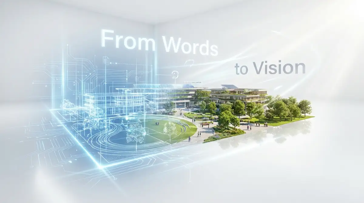
Why Your Words Are Getting Lost in Translation
Think of artificial intelligence as a highly skilled painter who happens to be completely blindfolded. This painter has memorined millions of pictures but cannot read your mind. If you tell this painter to draw "a nice car," they will panic. Do you want a cartoon car? A photorealistic sports car? A rusty truck in the rain?
This is the exact reason why most people fail at getting good results. They use vague, empty words. When you leave the details out, the system is forced to guess.
And let me tell you, these systems are terrible at guessing. They default to the most generic, boring styles imaginable. You must learn to be the director of your own digital movie set.
Building the Foundation of Your Request
To fix this, we need to completely change how we structure our sentences. A good instruction does not read like normal human conversation. It reads like a highly specific recipe.
The very first thing you must decide is the medium. Are you asking for a photograph, an oil painting, a 3D render, or a pencil sketch? If you do not specify this immediately, the system gets incredibly confused.
Always start your sentence with the format. For example, instead of saying "an apple on a desk," say "A macro photograph of an apple on a desk." This immediately locks the system into a specific mindset.
Expert Tip: Whenever I want something to look like a real photo, I stop using words like "draw" or "create". I use photography terms like "shot on 35mm lens" or "captured by a professional photographer". The system responds incredibly well to these specific industry terms.
Directing the Light and Atmosphere
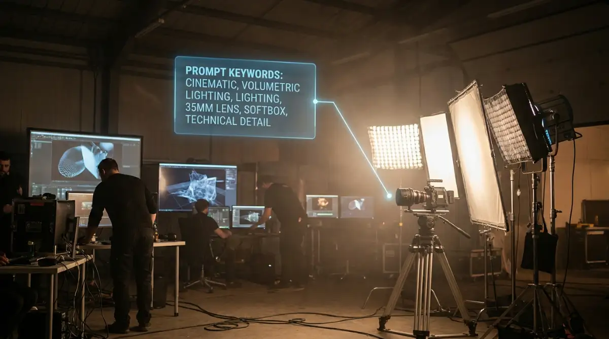
Once you have your core subject and medium, you have to think about the environment. Lighting is the single biggest factor that separates amateur outputs from professional ones. A flatly lit picture looks cheap and fake.
You need to tell the system where the light is coming from. Words like golden hour, soft studio lighting, or dramatic shadows completely change the emotional feel of the output.
Imagine you are placing lamps around your subject. Do you want harsh sunlight hitting their face? Or do you want a moody, neon glow from a city street?
Letting the System Know Your Camera Angles
Stop settling for boring straight-on shots. You have the power to put the camera anywhere you want. If you want a picture of a massive building, tell the system to use a "low angle, looking up" to make it look powerful.
If you want a picture of a coffee cup, ask for a "top-down view" or a "bird's eye view". These small additions force the software to think outside the box.
Check out this amazing video that visually explains how different camera angles completely change the mood of a picture.
Structuring Your Recipe for Success
I used to just throw a bunch of adjectives into a paragraph and hope for the best. I quickly realized that the order of the words matters immensely. The machine pays the most attention to the words at the very beginning of your sentence.
If your main subject is a blue bird, "blue bird" should be the first or second thing you type. Put your most important elements at the front. Save your background details, lighting, and camera angles for the end of the sentence.
I used to type "A beautiful sunny day in the park with lots of trees and in the middle there is a red bicycle." The system would focus on the park and the trees, making the bicycle tiny. Now, I type "A red bicycle in a sunny park, surrounded by trees." The difference in the result is absolutely mind-blowing.
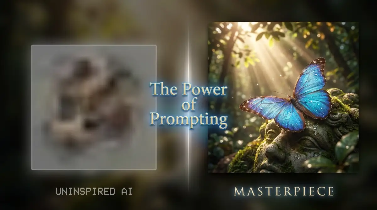
Adding Texture and Fine Details
Sometimes a picture looks mathematically perfect but feels plastic or fake. To fix this, you need to add texture keywords. Words like film grain, highly detailed, or 8k resolution push the system to add those tiny imperfections that make things look real.
If you are creating a portrait, adding "visible skin pores" or "flyaway hairs" stops the face from looking like a smooth plastic doll. It grounds the picture in reality.
Knowing When to Stop Editing
It is very easy to get addicted to adding more and more words. However, there is a breaking point. If you give the system too many instructions, it starts ignoring them.
Keep your sentences tight and focused. If a word does not directly change the visual output, delete it. Words like "very," "extremely," or "beautiful" often just waste space.
Instead of saying "a very extremely beautiful sunset," just say "a breathtaking, vibrant sunset." Be direct, be clear, and let the software do the heavy lifting. By organizing your thoughts and using precise language, you will gain total control over the creative process.
Pushing Your AI Art to the Next Level
You have already learned the basic recipe for talking to these visual systems. Now, we are going to look at the powerful tools hidden right beneath the surface. Getting a decent picture is easy, but getting exact control over your creative vision requires a deeper understanding of the system.
When you understand how machine learning works step by step, you realize that these tools need strict boundaries. The most powerful technique you can use is called a negative constraint. Instead of just telling the machine what you want to see, you must tell it exactly what you hate.
By clearly stating what should be left out, you force the system to focus entirely on the good details. According to a recent study on generative modeling by MIT researchers, defining visual boundaries helps the software process image data much faster. If you do not want a blurry background, do not just hope for a sharp image.
You must explicitly type words like "no blur, no out of focus, no messy lines" to block those errors completely. This creates a safe zone where bad pixels cannot exist.
Pro Tip: I always keep a saved digital notepad file with my favorite negative keywords like "deformed, extra fingers, messy, low resolution, ugly, watermarks". I instantly copy and paste this exact list into every single new project to save a massive amount of time and secure high-quality results.
Another massive secret is controlling your aspect ratio right from the beginning. People often forget this step and end up with a weird square image when they actually needed a wide banner for their website. You have to tell the software the exact shape of your canvas before it starts drawing.
By combining strong negative boundaries with the correct canvas shape, your results will instantly look incredibly professional. These small, calculated adjustments are the exact secrets to writing effective prompts for flawless AI images every time. You are essentially building a digital fence that keeps terrible outputs away from your screen.

The Hidden Traps Ruining Your Visuals
Even with the best intentions, it is incredibly easy to confuse these visual tools and waste your daily generation limits. The biggest issue I see on a daily basis is something called "word salad". People get overly excited and throw the entire English dictionary at the text box, hoping something wonderful happens.
When you overload the system with fifty different adjectives, the words just cancel each other out. The machine panics and usually spits out a muddy, confusing mess that looks like a bad fever dream. This leads to massive frustration, wasted credits, and a feeling of total defeat.
Common Mistakes to Avoid
- Mixing totally different art styles together, like asking for a "watercolor oil painting photograph".
- Leaving the main subject out until the very end of your paragraph.
- Demanding complex human interactions, like "five people all shaking hands while looking at different cameras".
- Using completely contradictory lighting terms in the exact same sentence.
- Typing full conversational paragraphs instead of direct, clear commands.
You simply cannot ask for a "bright, sunny midnight" unless you explain that a massive stadium spotlight is shining in the dark. The software takes your words completely literally. If you are trying to automate repetitive daily tasks at work with these tools, you need them to be efficient, not a source of endless headaches.
When you avoid these specific traps, you will immediately notice a massive jump in quality. Keep your ideas clean, logical, and perfectly aligned with the real world physics.
Quick Action Checklist
- Define your exact art medium before typing anything else.
- Pick one specific lighting style to set the emotional mood.
- Choose a clear camera angle or perspective for your scene.
- Add your negative constraints to actively block unwanted visual elements.
- Review your sentence to make sure your main subject is listed first.
Stepping Into Your Role as a Digital Director
You now have a complete understanding of how to communicate effectively with these powerful digital tools. You do not need to be a professional artist with a paintbrush to create breathtaking art. You just need to be a very clear, organized, and intentional director.
I wasted so many hours fighting with these systems before I finally understood the logic behind them. My workflow completely changed once I started treating my text inputs like direct, simple instructions rather than messy wishes. The beauty of this process is that once you get the hang of it, your imagination is truly the only limit you have.
You have the exact formula now, and I know you will create some absolutely amazing visuals today. Start small, test different lighting keywords, and watch how the software responds to your commands.
Which project are you planning to generate images for first? Let me know in the comments below!
Common Questions About Talking to Image Generators
Why do my generated images always have messed up hands?
The software does not actually understand human anatomy or bone structure. It only recognizes patterns of pixels, and fingers overlap in millions of different ways. Using negative keywords like "extra fingers" or deliberately hiding hands in pockets is the best temporary fix.
How long should my text description actually be?
Keep it between 20 to 60 words for the absolute best results. If you write a massive essay, the system will start completely ignoring the words at the end of your paragraph. Short, punchy, and highly descriptive sentences always win.
Can I use real brand names in my requests?
Yes, you can use popular brand names to influence the style or color palette of the image. However, the system usually messes up the spelling of actual text logos. It is much better to ask for the brand's general aesthetic rather than their exact logo.
Does punctuation matter when talking to the software?
Yes, commas are incredibly helpful for separating your thoughts. Commas act like small pauses, telling the machine to treat each descriptive phrase as a separate instruction.
Why did the machine ignore the background I asked for?
You likely placed your background details too far down in your sentence. The machine prioritizes the first few words it reads. Try moving your environment description much closer to the front of your prompt.
What is the best way to copy a specific artist's style?
Simply type "in the style of [Artist Name]" at the very beginning of your sentence. You can also mix two artists together by saying "a blend of [Artist A] and [Artist B]" for a highly unique look.
Do capital letters change the final picture?
No, capital letters do not change how the machine processes your words. You can type everything in lowercase and get the exact same stunning visual output.
How do I get exactly the same character in different poses?
This is quite difficult, but using a specific "seed number" helps lock in the character's facial features. You can also use highly specific character sheets or grid layouts to keep the visual identity perfectly consistent.
Is it better to use single words or full paragraphs?
A mix of both works beautifully. Start with a natural sentence describing your subject, and then use single, comma-separated keywords at the end for lighting and texture.
Why does my generated art look so plastic and fake?
You are likely missing texture keywords. Add terms like "film grain, visible skin pores, highly detailed, rough texture" to remove that smooth, artificial digital look.
Trusted Legal Resources
- U.S. Copyright Office - Artificial Intelligence Policies
- World Intellectual Property Organization - AI and Copyright
- Electronic Frontier Foundation - Free Speech and Generative AI
- Harvard University - Ethics in Artificial Intelligence
- Stanford University - Human-Centered AI Guidelines
- Creative Commons - Sharing AI Generated Works
Disclaimer
The information provided in this article is designed for educational and informational purposes only and does not constitute professional, legal, or financial advice. Artificial intelligence platforms, their terms of service, and global copyright laws are constantly changing. We strongly advise consulting with a qualified legal professional before using any generated visuals for commercial, business, or monetary purposes. FinanceInfoIn and its authors accept no responsibility or liability for any potential copyright disputes, legal actions, or account suspensions resulting from the use of the techniques discussed in this content. Please always follow the official community guidelines of the specific software you choose to use. Exploring more topics on the FinanceInfoIn homepage can provide further context on safe digital practices.
About the Author
Reviewed by Mithun Halder (Personal Finance & SEO Expert) & The FinanceInfoIn Editorial Team
The FinanceInfoIn Editorial Team researches personal finance, investing, insurance, mortgages, cryptocurrency, and consumer financial topics. Every article is carefully reviewed to provide clear, practical, and trustworthy educational information based on credible sources and industry best practices.
© 2026FinanceInfoIn. All rights reserved.